Grimaldi Group
Brand Book & Visual Guidelines
INTRODUCTION
Introduction to the Grimaldi Group Brand Book
This Guide has been designed to maintain the integrity and consistency ot the Grimaldi Group brand in ali its manitestations. From the logo, co/ours and typography to the images, every element ot the brand is carefully defined to ret lect the values and vision ot the Grimaldi Group.
The Grimaldi Lines brand belonging to the Grimaldi Group and dedicated to Ro-Pax lines is likewise defined and regulated. In visual terms, the Grimaldi Lines brand inherits both the application criteria and the colour and typographic elements trom the Group's brand.
Grimaldi Group is synonymous with reliability, innovation and quality in the maritime transport sector. The brand represents not only services but a/so a commitment to excellence and customer satisfaction. To this end, these Guidelines are an essential tool tor ali those working with and tor the Grimaldi Group and its branches, ensuring that ali communications and brand representation are accurate and consistent.
VISUAL IDENTITY
Visual architecture
The various versions of the Grimaldi Group logo
![]()
Grimaldi Group Logotype
Positive primary version
The main version of the Grimaldi Group logo uses a gradient with different shades of blue on the flag, to evoke a feeling of depth and dynamism.
![]()
Negative primary version
![]()
Monochrome versions
![]()
The monochrome version (above) is used for all communication elements where simplification of the application is necessary, both is terms of printing and optical matters.
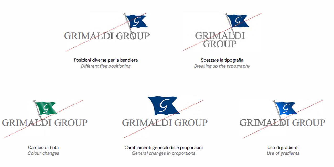
Don'ts